Bonus Content
Ugmonk’s $1m Analog Landing Page
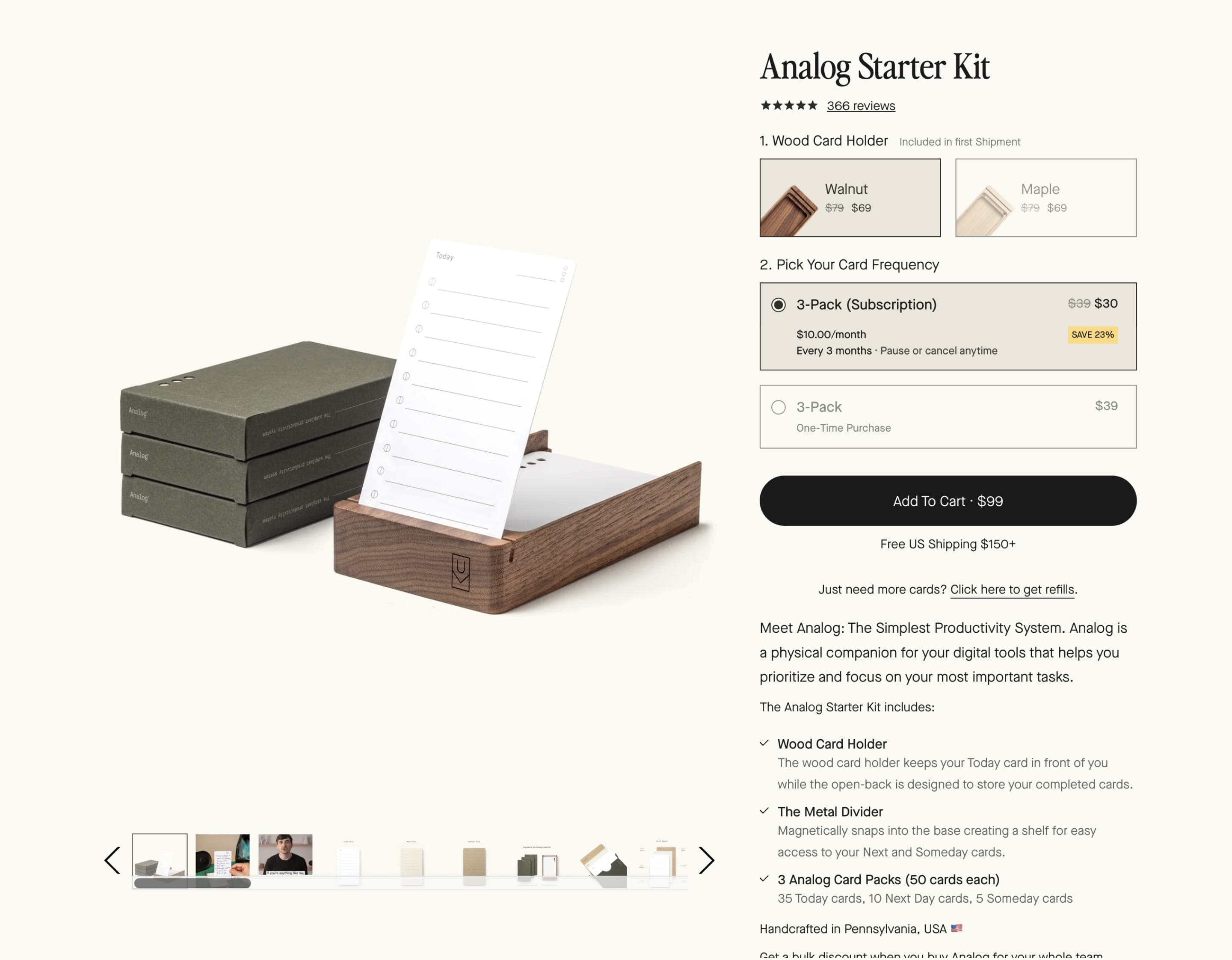
Ugmonk produces gorgeous products to help you organize your physical and mental workspace. Their top seller is the Analog productivity system, which has earned more than $1M in revenue. In this interview, I chat with founder Jeff Sheldon about the thought process behind this brilliant Shopify landing page. We cover explainer videos, copywriting, his DIY mentality, and how the new 3D animation hero communicates so much more than the original video could.
Inspiration
Good references
A collection of noteworthy visual references to spark ideas for your landing pages. Seen any other interesting ones? Let me know!
Ugmonk - Analog Landing Page
Visit referenceLoads to appreciate in this page from the incredible media to the upselling of add-ons upon checkout.
Useful
Resources
Links to external resources to help you dive deeper, find assets, or hire help to level up your landing page.
Dive Deeper
Bonus Content
Related course content I think you'll enjoy.

